

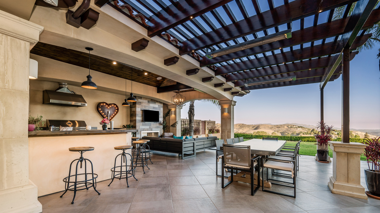
When planning a tile project, homeowners spend hours selecting the perfect porcelain, ceramic, or natural stone tile. Yet, one critical design element is frequently treated as an afterthought: the grout.
Grout does far more than hold tiles in place and keep moisture out of the subfloor. The width of your grout joints and the color you select alter the room’s perceived dimensions, maintenance demands, and overall style.
How Grout Joint Width Shapes Room Aesthetics
The distance between your tiles determines how structured or seamless your floor looks.
Thin Grout Lines (1/16 to 1/8 inch): Extremely narrow grout lines create a clean, modern, virtually seamless look. This approach works exceptionally well with rectified tiles—tiles with precision-cut, perfectly square edges. Minimal grout lines allow large-format tiles to visually expand small rooms.
Standard to Wide Grout Lines (3/16 to 3/8 inch): Wider grout lines suit hand-crafted, rustic, or tumbled edge tiles, such as slate or terracotta, where natural edge variations require more breathing room. Wider lines provide a classic, traditional aesthetic and added traction in wet areas.
The Impact of Grout Color Selection
The relationship between your tile color and grout color dictates whether the floor presents a unified surface or a striking geometric pattern.
1. Matching Grout (Low Contrast)
Choosing a grout color that closely matches your tile creates a monochromatic look. This minimizes the visual separation between individual tiles, making the entire floor feel larger and more open. It is a favored design technique for small bathrooms, narrow hallways, or sleek modern spaces where you want the focus on room scale rather than tile patterns.
2. Contrasting Grout (High Contrast)
Using dark grout with light tile—or light grout with dark tile—emphasizes the shape and layout of each individual tile. This technique makes brick, herringbone, subway, or hexagonal patterns pop off the surface. While striking, high-contrast grout highlights any alignment inconsistencies during installation, requiring precise craftsmanship.
3. Neutral Grout (Mid-Tone)
A soft, neutral grout (such as warm beige, soft taupe, or mid-tone gray) offers a balanced middle ground. It defines the tile layout gently without creating harsh gridlines, making it a versatile option for open-concept kitchens and living areas.
Practical Maintenance and Longevity Considerations
Grout choice is not strictly aesthetic; daily wear and cleaning routines must be considered.
Very light grout on main entryway floors or kitchen prep zones requires regular sealing and frequent scrubbing to remain pristine. Darker grout hides dirt, shoe scuffs, and daily wear much better, making it highly practical for high-traffic rooms, utility spaces, and mudrooms.
By matching the right grout width and shade to your room’s layout, you turn standard tile installations into high-impact design features.


